Disney World continues to make incremental changes across Magic Kingdom, and the latest update involves the Disney Vacation Club kiosk in Tomorrowland receiving a complete overhaul, which is generating mixed reactions from guests who’ve noticed the transformation. The new color scheme represents a dramatic departure from what has been there for years, and not everyone is convinced that the change improves the area’s aesthetic.
The Disney Vacation Club kiosk now features shale gray columns where bright teal once dominated, creating an immediate visual disconnect from the surrounding Tomorrowland environment. The architectural details on the building’s front fin and the sides of the roof feature a similar gray tone, but with an added splotchy texture that seems intended to create visual interest, yet ends up looking somewhat unfinished or haphazard.
The rings on the pole positioned behind the sign have been repainted bright red, replacing the previous yellow and creating a bold accent that stands out but doesn’t necessarily harmonize with the rest of the structure or the broader Tomorrowland color palette.
Some of the lighting fixtures mounted on top of the kiosk have received a brownish-red paint treatment. However, at least one fixture remains unpainted, suggesting either that the work is still in progress or that Disney has intentionally left some aspects in their original state. The transformation is noticeable but inconsistent, leaving a somewhat unresolved feeling.
What Hasn’t Been Addressed
Perhaps more notable than what changed is what remains missing. The dome that used to sit atop the kiosk’s spaceship structure was removed several years ago ahead of an approaching hurricane and has never been replaced. That absence persists, leaving the structure feeling incomplete, regardless of how fresh the paint job may be.
The missing dome has become one of those lingering Magic Kingdom details that longtime guests notice and wonder about. The new paint job doesn’t address this question, and the kiosk continues to look somewhat unfinished at its highest point, even as fresh colors cover everything below.
The Aesthetic Question
The shift away from Tomorrowland’s signature bright teal toward muted grays creates a visual inconsistency that’s hard to ignore. The nearby Star Traders, visible in photos of the kiosk, still features the traditional bright teal that has defined Tomorrowland’s color scheme. That contrast makes the Disney Vacation Club kiosk feel out of place rather than cohesive with its surroundings.
The splotchy texture applied to the gray architectural details doesn’t read as intentional weathering or creative design. It looks somewhat messy, as if paint was applied inconsistently or the surface underneath is showing through in ways that weren’t intended. The bright red rings on the pole provide a pop of color but fail to visually connect with anything else on the structure or in the immediate area, making them feel arbitrary rather than thoughtfully integrated into a broader design scheme.

This isn’t to say the previous color scheme was perfect or that change is inherently bad. Tomorrowland has evolved aesthetically multiple times over the decades as Disney’s vision of the future changes to reflect contemporary design sensibilities. However, successful aesthetic updates feel intentional and cohesive, creating environments where color choices and design elements work together rather than competing or contradicting one another.
The Disney Vacation Club kiosk’s new look doesn’t quite achieve that cohesion. It feels like change for the sake of change rather than change in service of a clear artistic vision. The colors don’t harmonize, the textures don’t enhance, and the overall effect is somewhat jarring rather than refreshing.
The Silver Lining
That said, any attention Disney pays to Tomorrowland deserves acknowledgment, even if specific execution leaves room for improvement. Tomorrowland has often felt like Magic Kingdom’s neglected land, receiving less investment and creative energy than other areas. At the same time, guests watch as Fantasyland expansions, Frontierland updates, and Main Street, U.S.A., refinements take place around it.
The Disney Vacation Club kiosk paint job, regardless of aesthetic merit, signals that Disney is actively working in Tomorrowland and is willing to invest resources in refreshing the area. That matters because it suggests the land hasn’t been completely forgotten or written off as a low priority.
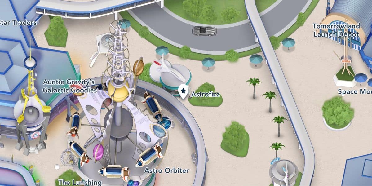
More significantly, the recent opening of AstroFizz represents genuinely positive progress for Tomorrowland. AstroFizz replaced the former Cool Ship location, bringing new energy to the area with a menu designed to appeal to contemporary guest preferences, while fitting Tomorrowland’s futuristic theme.
AstroFizz serves popcorn alongside Coca-Cola, Fanta Blue Raspberry, and Fanta Orange frozen slushies, providing refreshing options for guests navigating the Florida heat. The standout menu item is the Cherry Cola Churro, which gets rolled in cherry sugar, drizzled with Coca-Cola Cherry icing, and topped with cherry popping candies. It’s creative, Instagram-worthy, and the kind of unique offering that makes quick service locations memorable rather than forgettable.
The AstroFizz opening represents the kind of Tomorrowland investment that actually enhances the guest experience in meaningful ways. New food options with creative presentations provide guests with reasons to visit and enjoy the area, rather than just passing through on their way to Space Mountain or Buzz Lightyear.
Perspective on Progress
The Disney Vacation Club kiosk’s new color scheme may not be visually pleasing, and its execution may feel inconsistent or poorly conceived. Still, it exists within a broader context of Disney paying attention to Tomorrowland after years of relative neglect. The kiosk refresh is happening alongside more significant improvements, such as AstroFizz, which actually move the land forward.
It’s possible to acknowledge that the kiosk doesn’t look great while still appreciating that Disney is investing in Tomorrowland at all. The land needs updates, attention, and creative energy to make it feel fresh and relevant, rather than dated and overlooked.
The AstroFizz opening proves Disney can deliver quality Tomorrowland updates when they commit to doing so. That quick service location brought genuine improvement with creative menu items and an atmosphere that fits the land’s theme. That’s the kind of attention Tomorrowland needs more of.
For now, guests visiting Magic Kingdom can observe the Disney Vacation Club kiosk’s new look and form their own opinions about whether the gray and red color scheme works. And they can enjoy AstroFizz as evidence that when Disney focuses on creating quality experiences in Tomorrowland, the results can genuinely enhance the land.